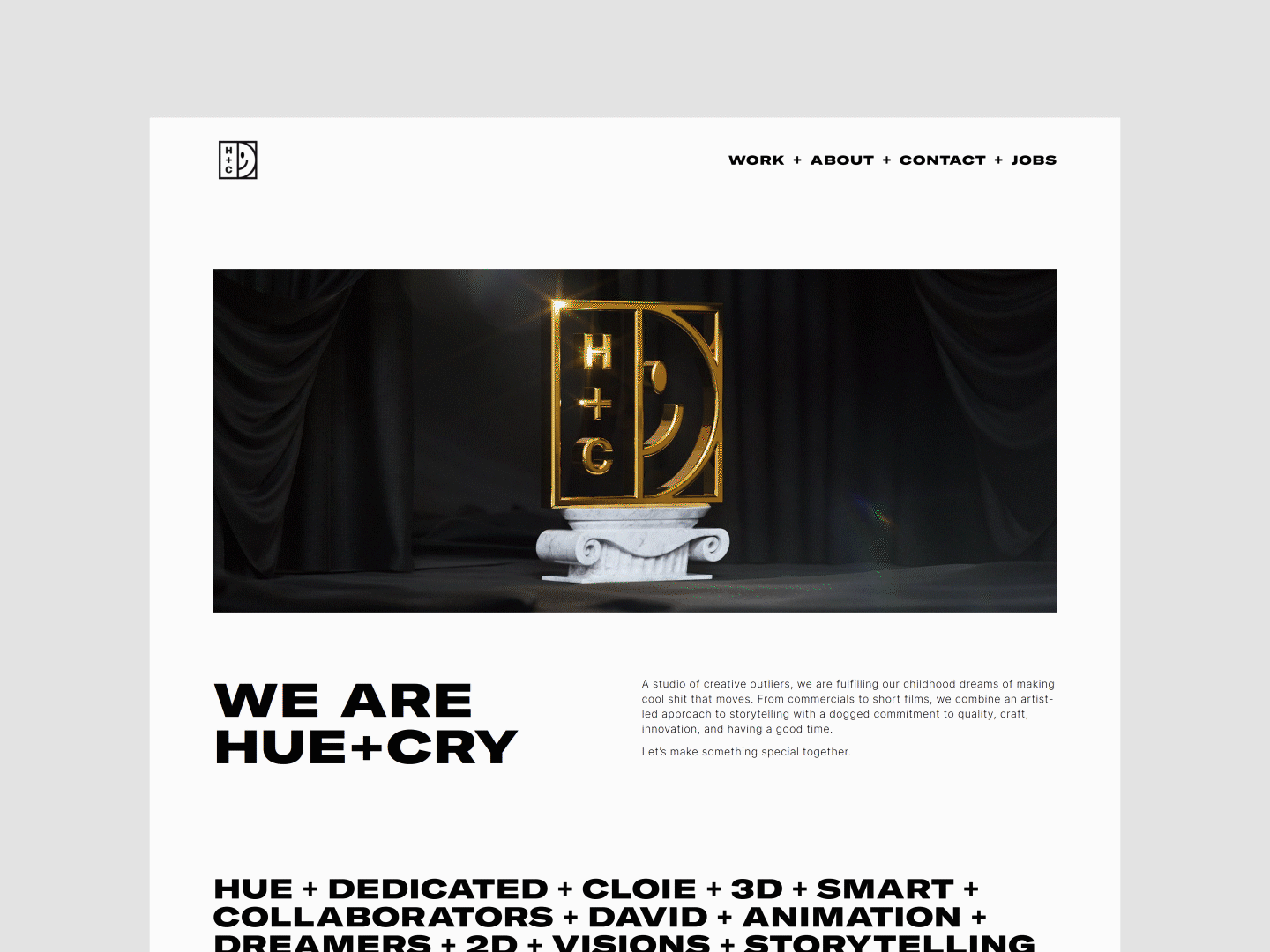
Hue+Cry
Rebrand
➔ H+C is a design centric animation studio. The new visual identity embodies this creative spirit and pairs it with the friendly yet minimalist aesthetic.
The result is a fresh and distinct identity that can take center stage when needed while being confident enough to step back and let the work shine.
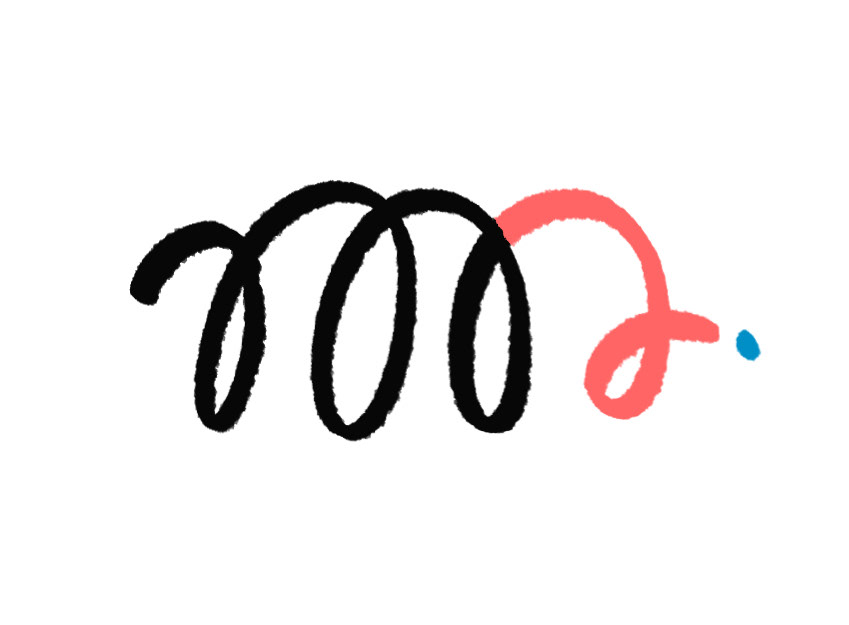
Anthem Video
➔ We created this kick-ass piece to help better tell the world what we are all about (and get thousands of likes on social media 😉).
The mix of animation techniques, illustration executions, infectious mograph with inspired transitions, and absolutely BANANAS track made for a winner.
So hit play and turn it up! Shoot, go full-screen while you are at it.
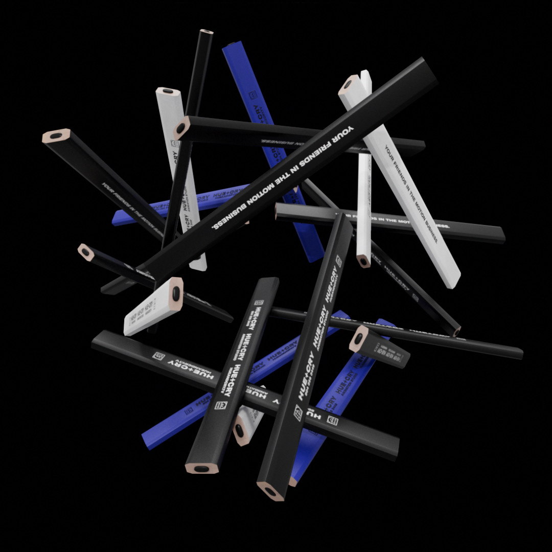
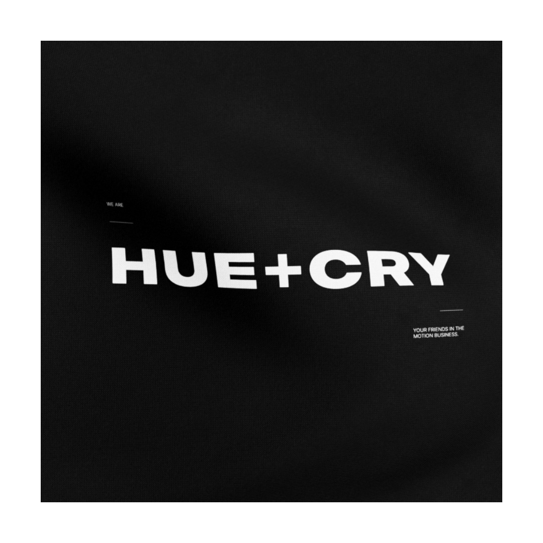
LOGO + WORDMARK
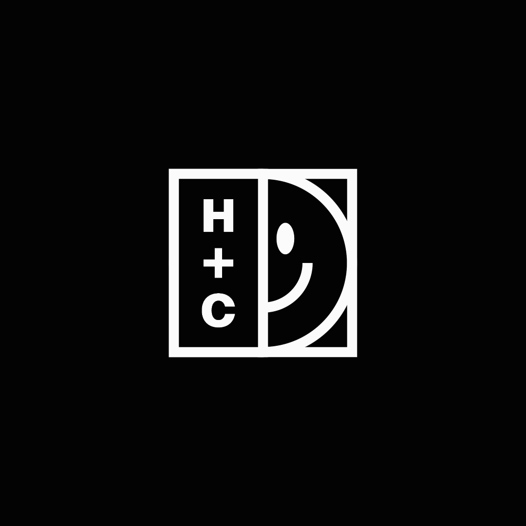
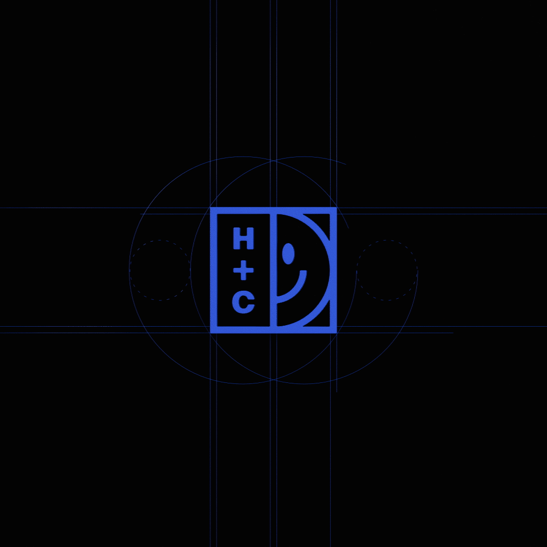
➔ The new logo combines the structured nature of our work with the playful spirit of our studio. Built on a simple grid, the logo works as a variable system with interchangeable iconography. This framework gives us a unified, yet flexible, design system for our brand.
The wordmark takes a no-nonsense approach, leveraging crisp, minimalist letterforms that have been meticulously crafted, resulting in a balanced, monolithic appearance.
The wordmark takes a no-nonsense approach, leveraging crisp, minimalist letterforms that have been meticulously crafted, resulting in a balanced, monolithic appearance.

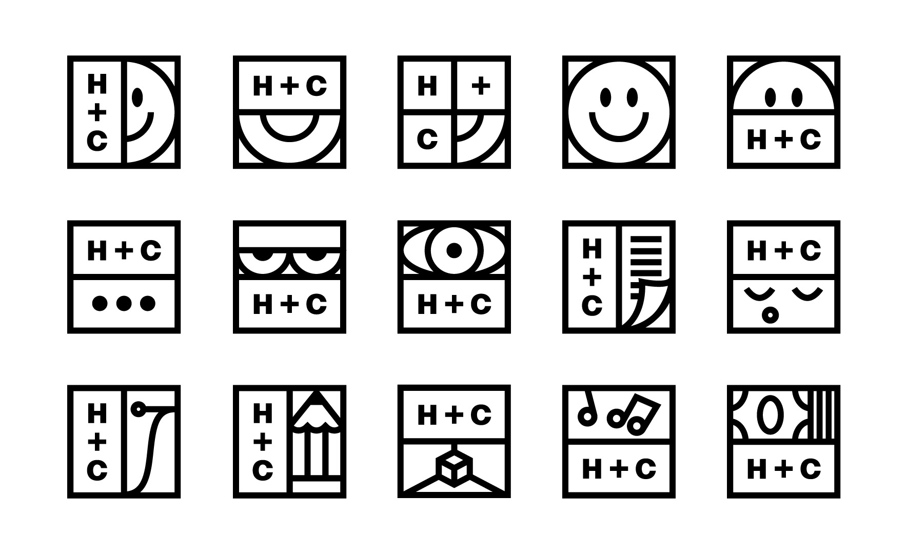
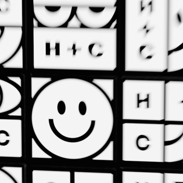
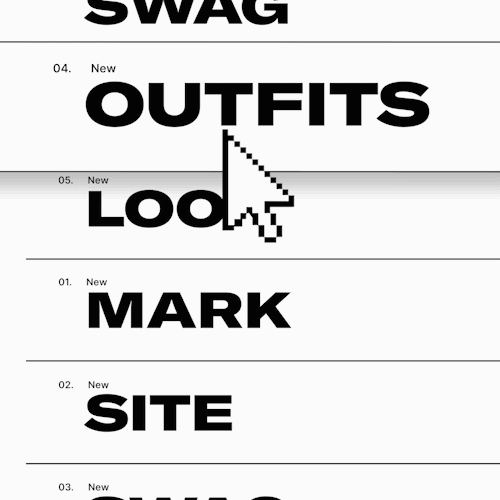
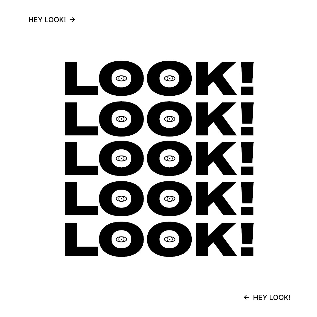
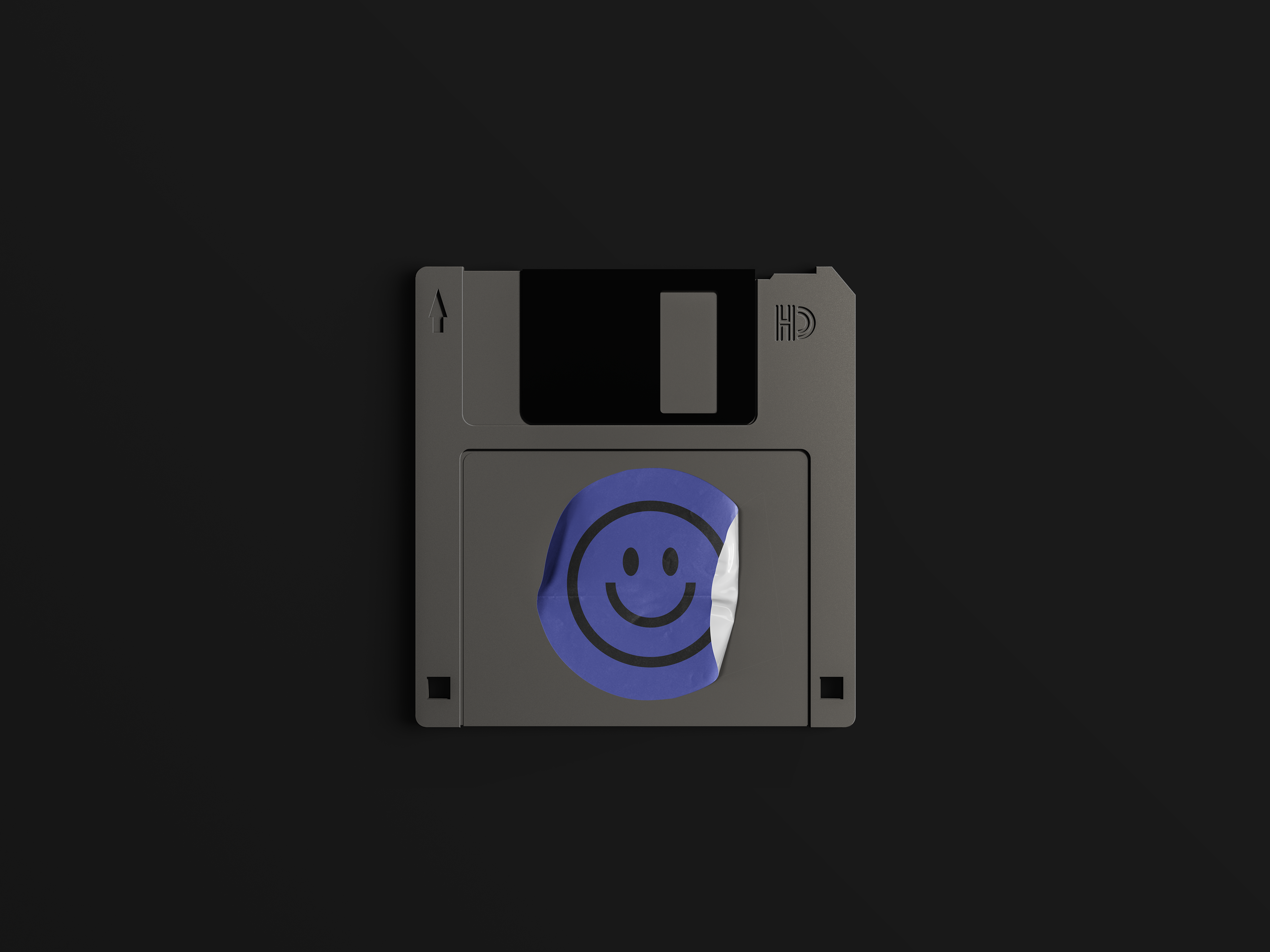
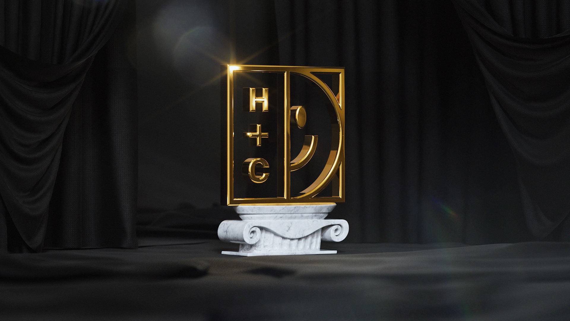
ICON SUITE
➔ Our ever-evolving icon suite is derived from the variable logo system. Each iteration retains the H+C letters for brand consistency, but either changes the smiley framing or replaces it entirely with another element. These elements are intrinsic cues to HUE+CRY — whether a mood, expertise, or insight.
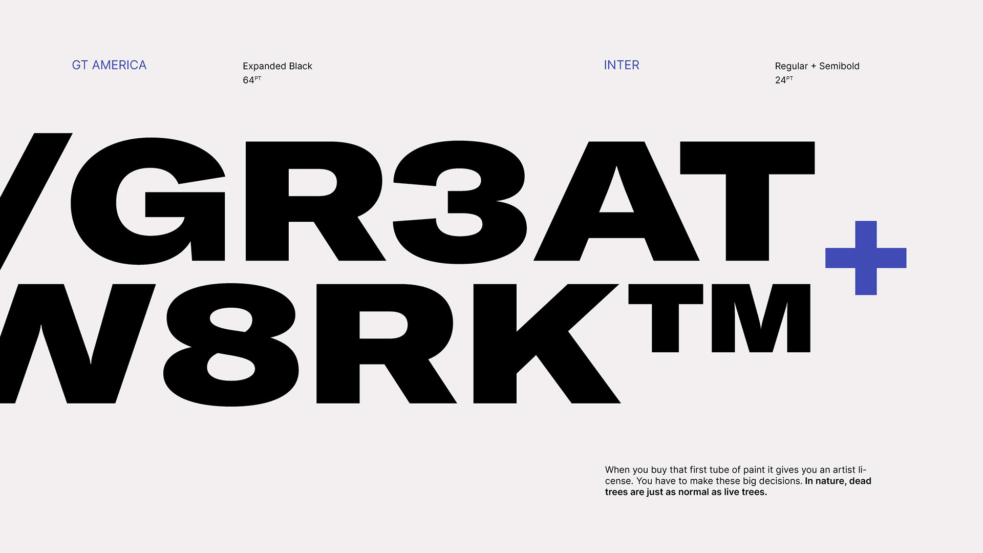
TYPOGRAPHY
➔ The brand’s primary typeface is GT America Expanded Black. Bold and confident in posture it helps convey our straightforward, yet distinctive, design approach.
Inter, our supporting typeface, is both functional and friendly. Its simple utilitarian nature matches well with our clear style of communication.
Inter, our supporting typeface, is both functional and friendly. Its simple utilitarian nature matches well with our clear style of communication.
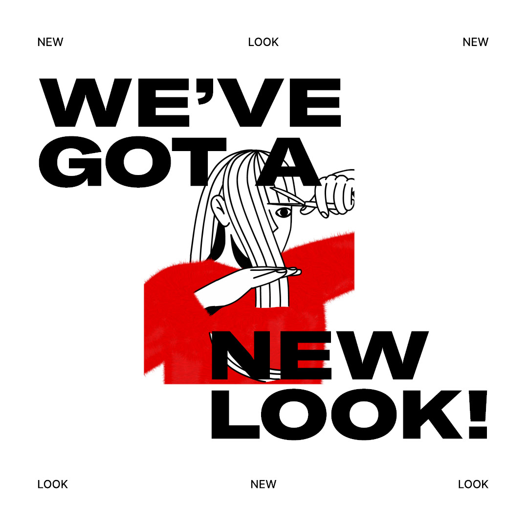
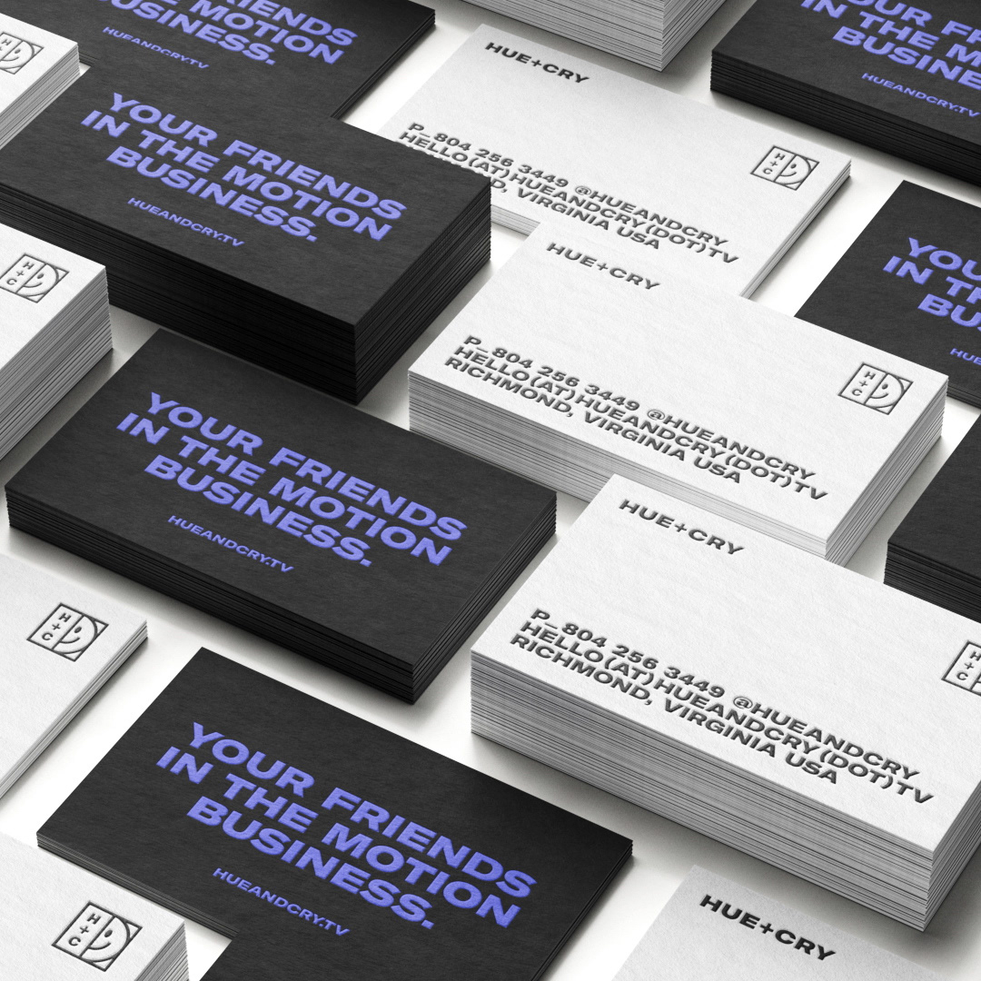
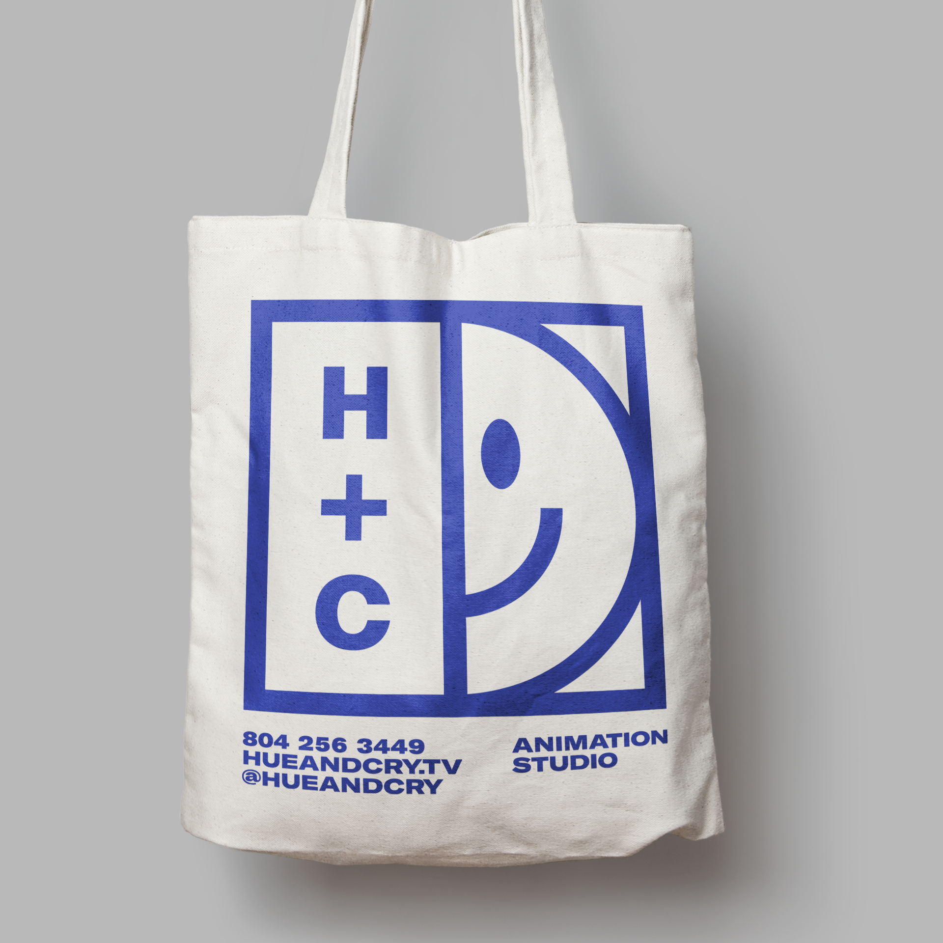
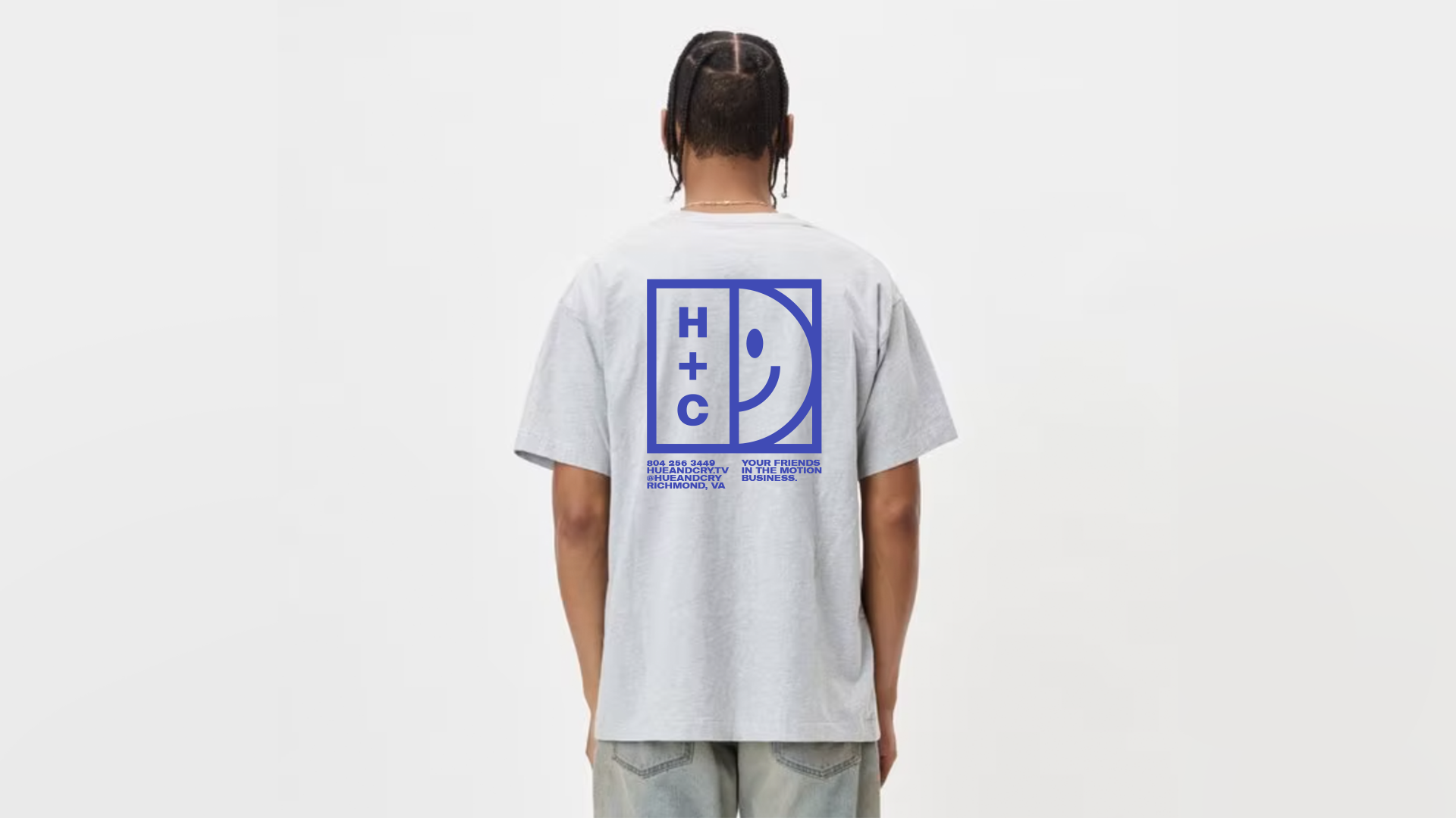
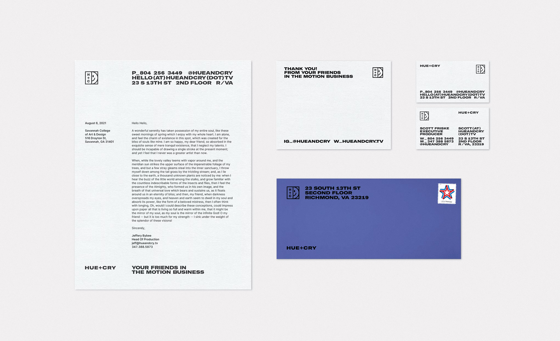
COLLATERAL
➔ The rest of our design system uses a utilitarian minimalist approach. There are restrained type layouts, limited type sizes, a spare color palette, and a dash of workaday humor in the copy for a sensible appeal.
This aesthetic stands out with confidence in the various collateral assets and when used in conjunction with our work it provides a clean framework to let the art shine.
This aesthetic stands out with confidence in the various collateral assets and when used in conjunction with our work it provides a clean framework to let the art shine.
Role: Creative Director
➔ Full credits @ Hue+Cry